These are three photographs from the past year that are not good, but they could be a starting point, or have been. I love photographs that teach me stuff.
1)

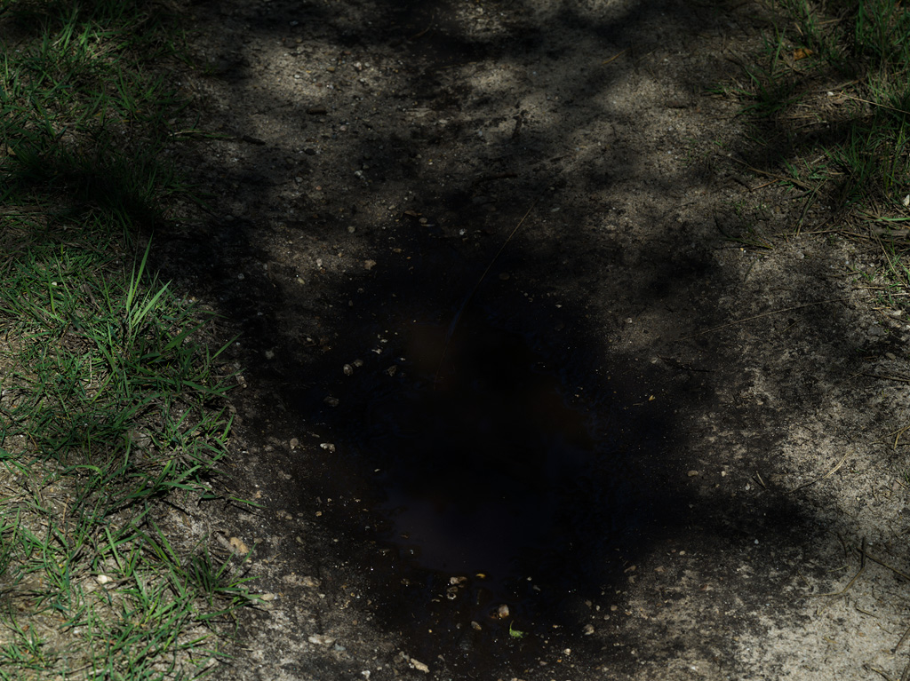
This is a clear example of inadequate gear. I knew that already going in (from a previous experience) but still wanted to take it, to see if it would work had I owned some means of tilting the focal plane. I dare say it would work, love the shadow merging with the water (or the other way around). Paramount however, like with the other picture, is that the whole ground is in focus. Otherwise the out of focus areas distract too much from the effect you are trying to achieve. In addition, part of the interest lies in distinguishing all the things, which is unpleasant or impossible in the out of focus areas.
2)

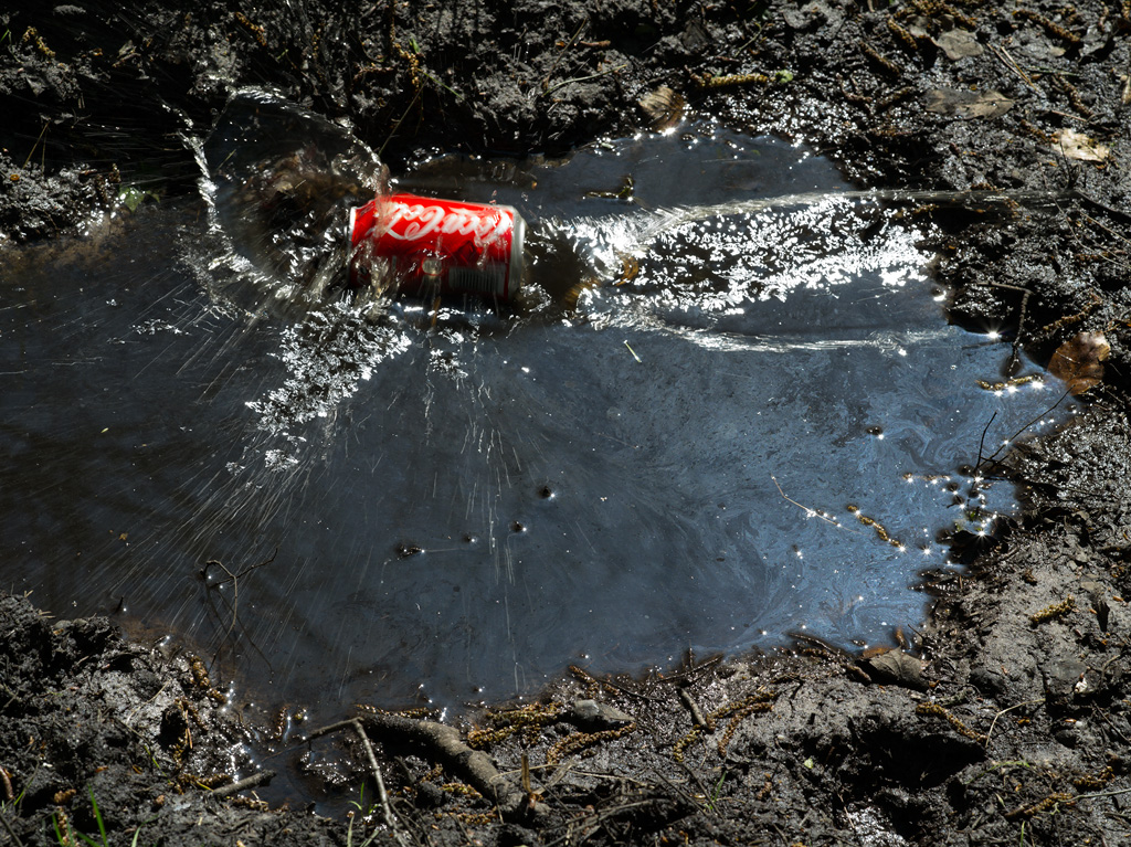
This photograph turned out fine, but the concept is lacking. I love the movement, the little red detail in a colourless world, the bright sunlight reflecting on drops, waves, squirts, bubbles. With the soda can it is trying too hard however. And throwing something in the water for effect, in the year 2014… really? Water can be fascinating on its own, which I intend to prove with my upcoming series entitled Water. (The oily substance consists of algae I am told, and I took the can with me and disposed of it at home, so no real pollution here.)
3)

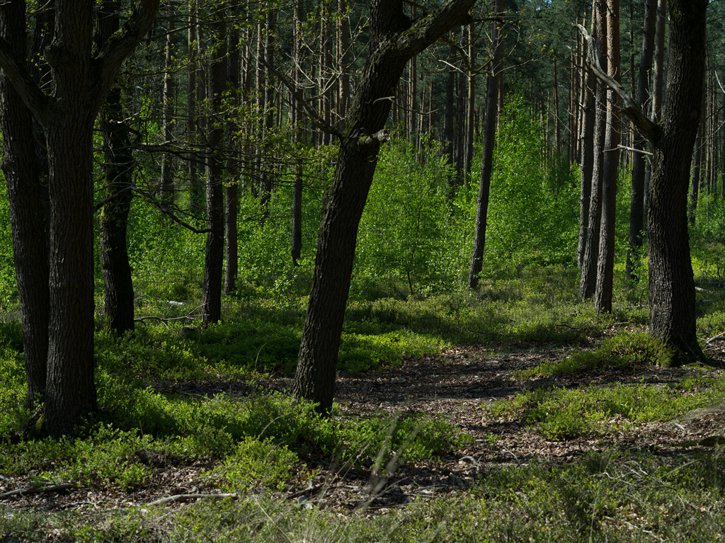
This photograph is just the way I like it. However, people glance at it and look away before noticing the fence. Without the fence the photograph is no good. Therefore maybe a) the fence needs to be slightly less subtle, b) the rest of the photograph needs to be more interesting so the viewer will linger long enough to start noticing the fence, c) it needs to be part of a bigger series that has the word Fence printed large, bold and several times, in the introduction text. For now I am going for the last option.
Slowly learning
Leave your thoughts below.
