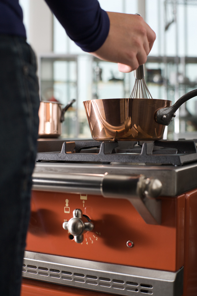
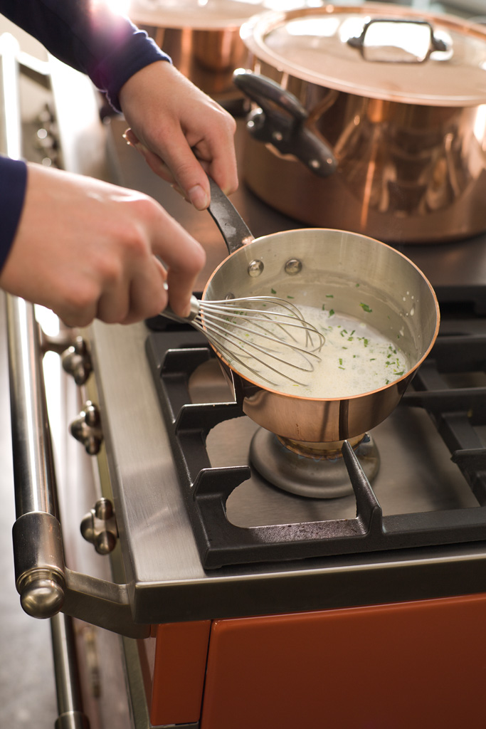
Recently I was asked to shoot a cover for a magazine (it didn’t get published eventually). The briefing: a copper saucepan by Mauviel being used to make a sauce. I could work in a nearby cooking studio and one of the employees of the client was going to be a model.
For a cover you need the photograph to be in portrait orientation (duh), have some extra room for cropping (bleed), especially on the top and / or bottom, and leave room for some text. That last part was difficult for me, since I tend to balance my photographs carefully, which seldom leaves room for alien elements.
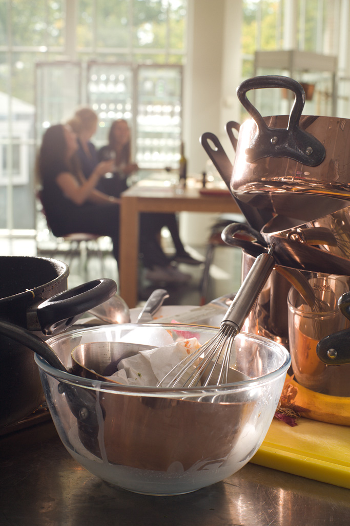
Most importantly, I wanted the cover to grab attention so the magazine would be picked off the shelf. I made three alternatives, 1 safe bet, 1 more dynamic and closer to the briefing and 1 (slightly) outside the box, as I usually do.


