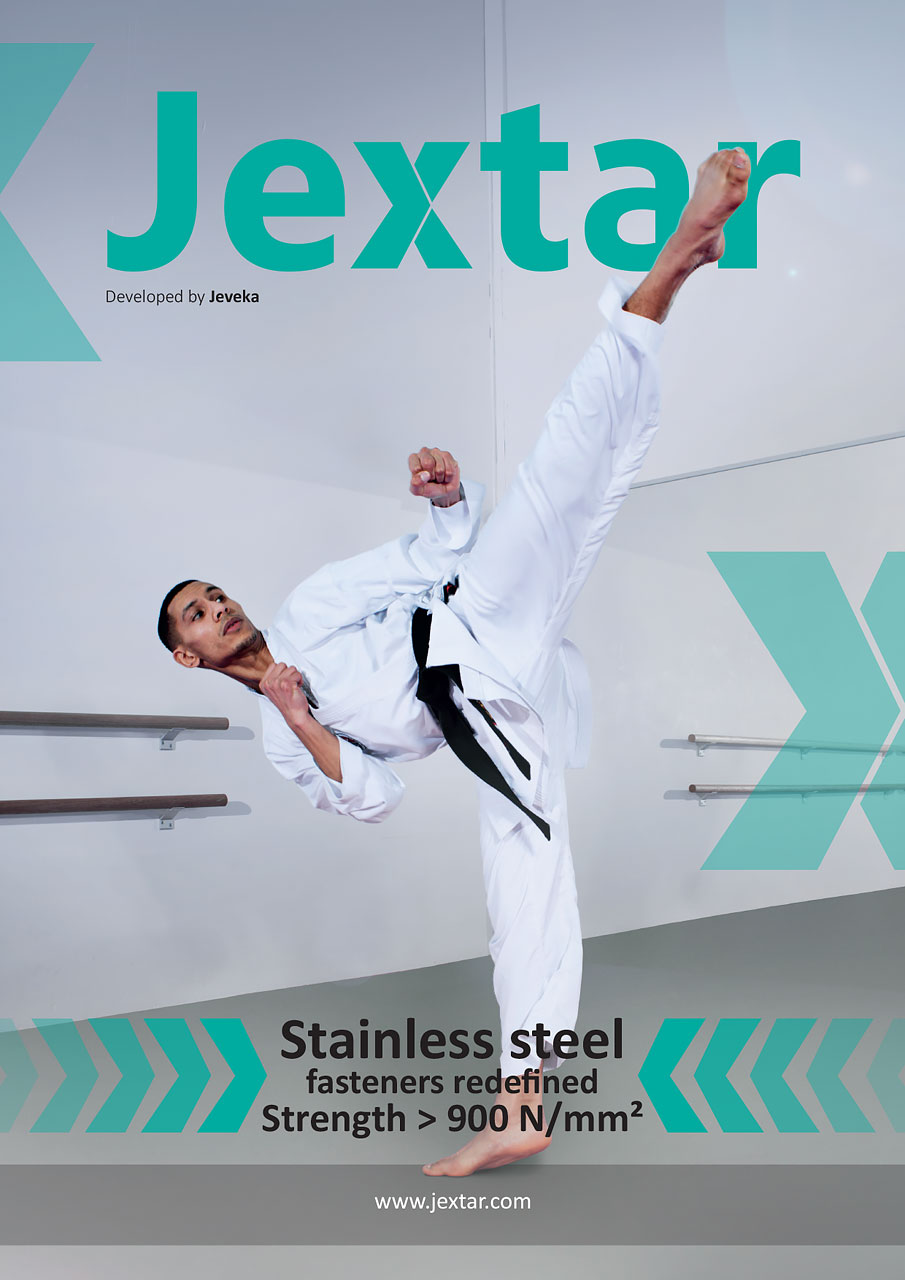
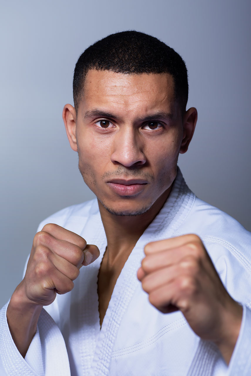
A couple of weeks ago I shot some photos of karateka Yassine, currently training to participate in the 2020 summer Olympics. The photoshoot was for the cover of a brochure where a sense of strength was wanted. We shot different options, in the end the one with a really high kick was chosen to appear on the cover. My personal favorite from the photoshoot is the semi-close portrait that appears at the end of this post, but less suitable for the brochure. We went to a dojo of a friend of his to do the photoshoot.

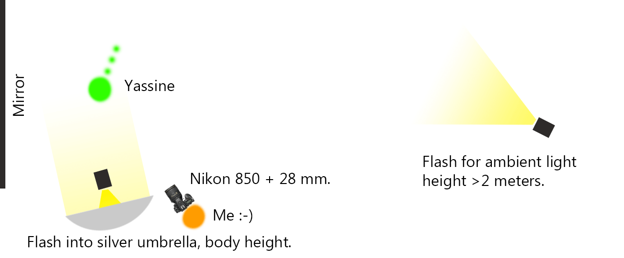
To have a bit of room around him I shot him next to a large mirrored wall. We removed unwanted items from the walls first and then I setup the two lights. One light reflecting into a silver umbrella lighting Yassine, one light without modifiers to the right at a distance and fairly high, to create some ambient light. A silver umbrella yields more pronounced light on a body than a white one all other things being equal, hence I like it for male subjects.
Of course the floor was a nightmare, so I had to replace that with a grey texture. Also the color red bouncing off his white pants needed to be removed. To make him stand out I performed several adjustments in contrast and color. Removed the logos from his jacket and even added a flare for some interest, make the surroundings less flat. The green behind his foot is the same color as the logo that is displayed behind his foot on the brochure. I had to photoshop this in to make his motion-blurred foot blend in nicely with the background. This is also one of three reasons why I had to cut out Yassine with the pen tool, to be able to place him in front of the logo in Indesign. The other two reasons being moving in the different floor and more easily adjust color and contrast on him.

Behind the scenes video (shot by Ilse, thanks!):
My favorite image from the karate photoshoot:
