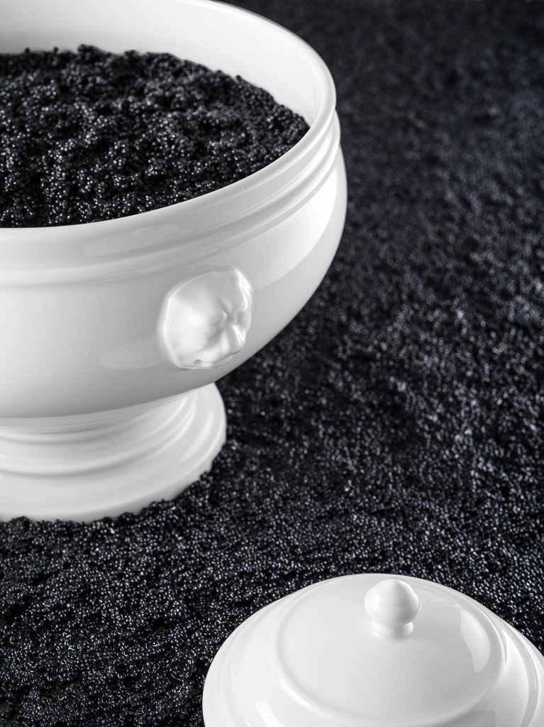
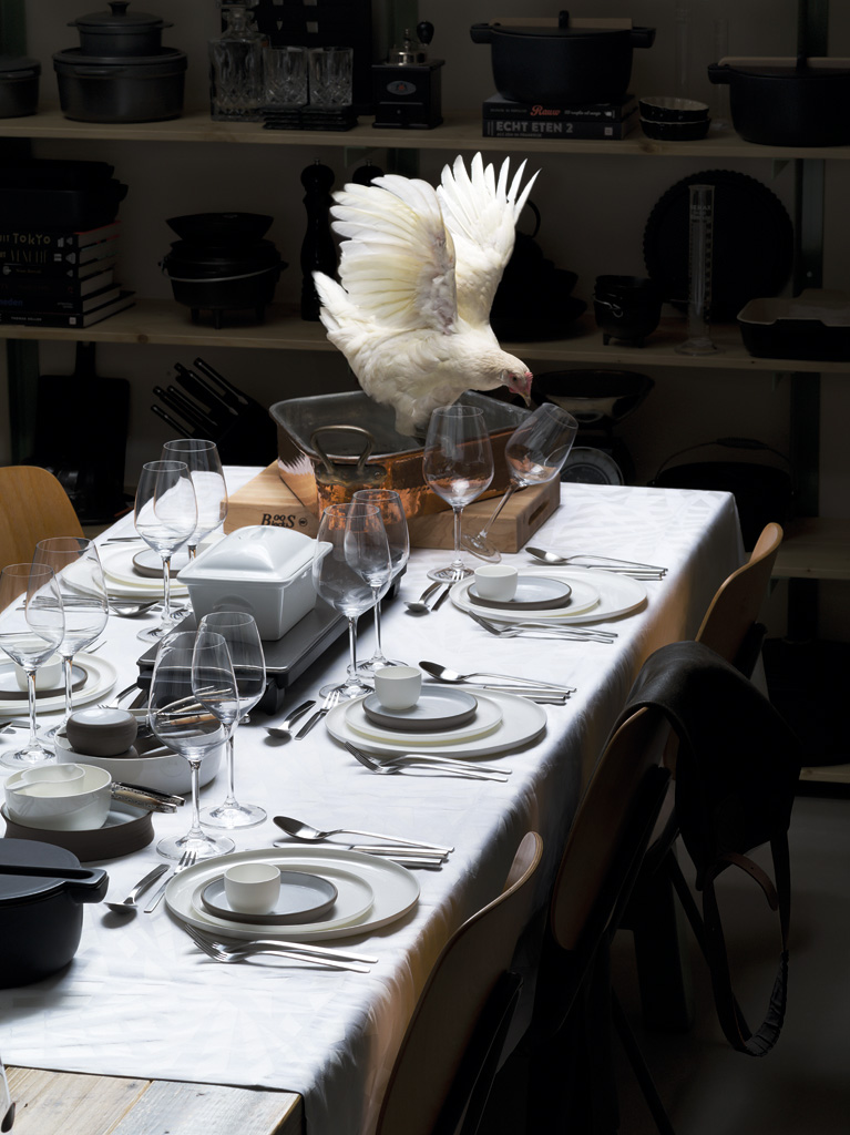
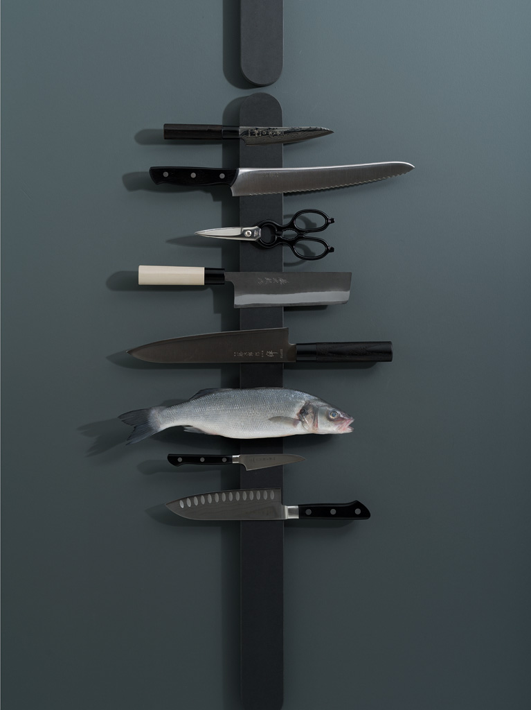
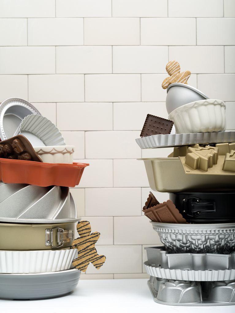
A couple of weeks ago I shot some photographs for a well known cooking utensils store. This was for their yearly promotional brochure that came out just now. “Pure” and “perfection” were key, as well as polished versus raw (or smooth versus rough, a lot of terms were used). I had a lot of fun creating the photographs and I think we (a small team was assembled) did a good job. The cover photograph was not used on the cover in the end, but that is of course at the discretion of the client. Sample this:


Nice and funny shots! I just had a look at the mentioned promotional brochure, some other nice shots in there too.
Those are awesome! Perfect execution of the theme!